Lighting and Colour within Animation:
Lighting and colour can really enhance a scene or film through various colour palettes, tones, contrast and hues. The most common technique is called colour scriping, the colour scheme varies to coincide with emotional beats and story arcs in a film. Examples of a colour script is below.
Colour Script:
Colour scripts are a functional purpose in animation, this is due to the non-linear production process of computer animation, the director needs all the clues he can get as to what the finished image might look like on the screen. The colour script is an early attempt to map out the colour, lighting, emotion and moods in a film. Its not about making a single pretty piece of art; the colour script evolves throughout the early stages of film, working hand in hand with story development.
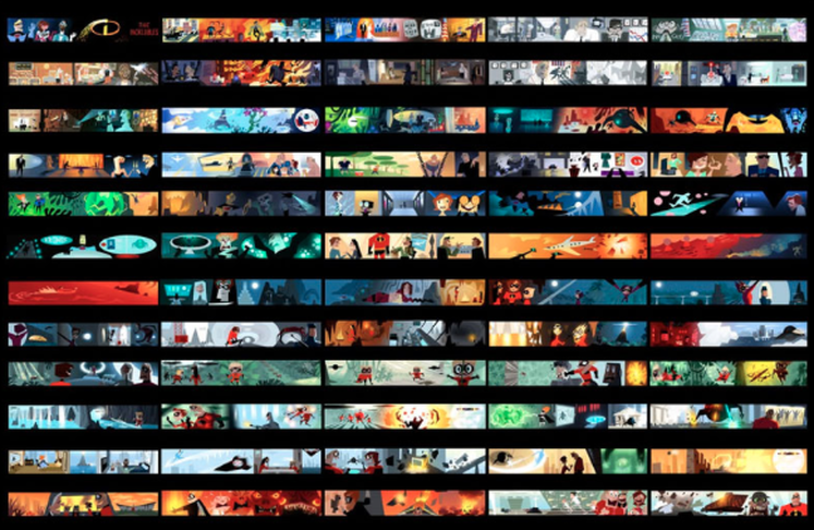
Colour Script - The Incredibles
The more ways a director can see their film, the better. By itself, a colour script will not make or break a film, however it can definitely help the studio evolve their ideas and figure out different approaches to the story they are telling. A film's colour works best when it follows a clear path from start to finish. Sometimes there is a tendency to view colour as an afterthought, but those who plan their colour nd exploit it's possibilites can and will create a richer and more emotinally engaging flm experience for their viewers. For example, Pixar uses colour scripts for each of their films as it allows them to map out the experience from beginning to end.
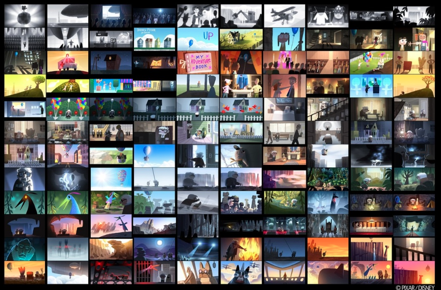
Colour Script - 'Up' ()
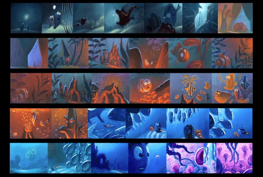
Colour Script - 'Finding Nemo' ()
The Meaning Behind Colours:
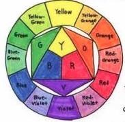
Within the Colour Theory, you have Primary and Secondary Colours; they both should compliment each other when they are opposite one another - representing a complimentary colour. Also, whatever is on the same side of the wheel is classified as 'harmonious' colours. Anything that is within the three colour swatches is classed as one of these.
Furthermore, another way to create balance and variety in a composition is to use the colour attribute which is known as 'value'. Value equivocates to tone, this is when you are dealing with tonal colours. This means often using pencils to create a dark and light version of what you are drawing. The technique of squinting your eye to see the values within an image can often help an artist recognise the lightness and darkness of a colour.
Furthermore, another way to create balance and variety in a composition is to use the colour attribute which is known as 'value'. Value equivocates to tone, this is when you are dealing with tonal colours. This means often using pencils to create a dark and light version of what you are drawing. The technique of squinting your eye to see the values within an image can often help an artist recognise the lightness and darkness of a colour.
Deviation is painting in values that are used to give volume and to help focus the eye on to an area of composition. Also taking your focus down to a particular part of the composition. You can use this within cinematography where you can use positive and negative space with light, the darkness within framing can help shift your focus to a particular object.
The term ‘on the painting’ is where you create a tonal image underneath to highlight where you would like the focus to be. You can then layer the colours up to achieve the tonal difference you want. You can create the illusion of depth where gradiations of value are also used.
In image making it is rare to encounter images that use a palette of entirely pure hues, Value is more important than colour to the design and success of a painting. Most often an artist will incorporate a massive array of colours to deifine a specific area within their image – a concept which applies to animation, illustration and visual arts. The value of any colour can be altered by changing the amount of luminance that is mixed with the pure hue.
For example, red can become light pink if you add white. Whereas maroon by adding black. Pink is a ‘tint’ of red, maroon is a ‘shade’.
References:
http://pixar-animation.weebly.com/colour-script.html
