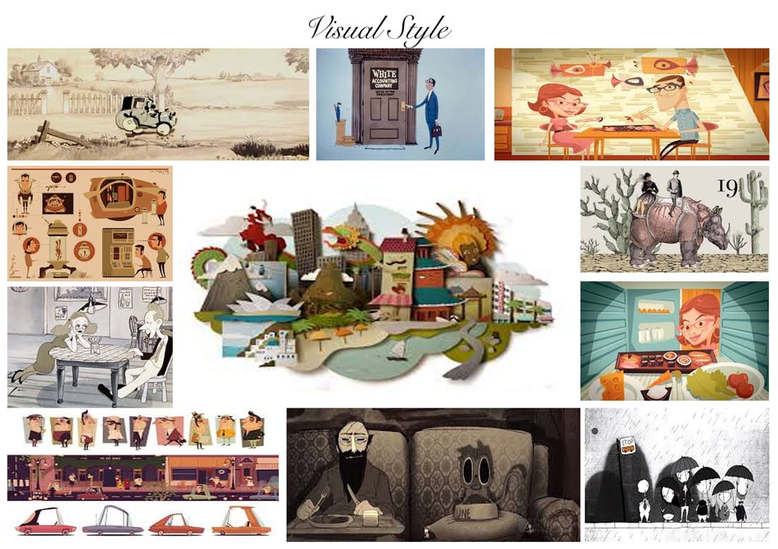
Visual Style Moodboard:
For the visual style of my Documentary I created a mood board so that I would be able to pin point the techniques, settings and layouts I aspire my Documentary to look like. The majority of these images are taken from animated sequences where they have used cut-out animation alongside compositing to produce a piece of work that looks aesthetically interesting.
The colours I have used are washed out in tones such as orange, blue and black. These are the main three colours I will be using for my documentary to connote the beginning of my Nan's life, her life with Joey and the Governments involvement.
The colours I have used are washed out in tones such as orange, blue and black. These are the main three colours I will be using for my documentary to connote the beginning of my Nan's life, her life with Joey and the Governments involvement.
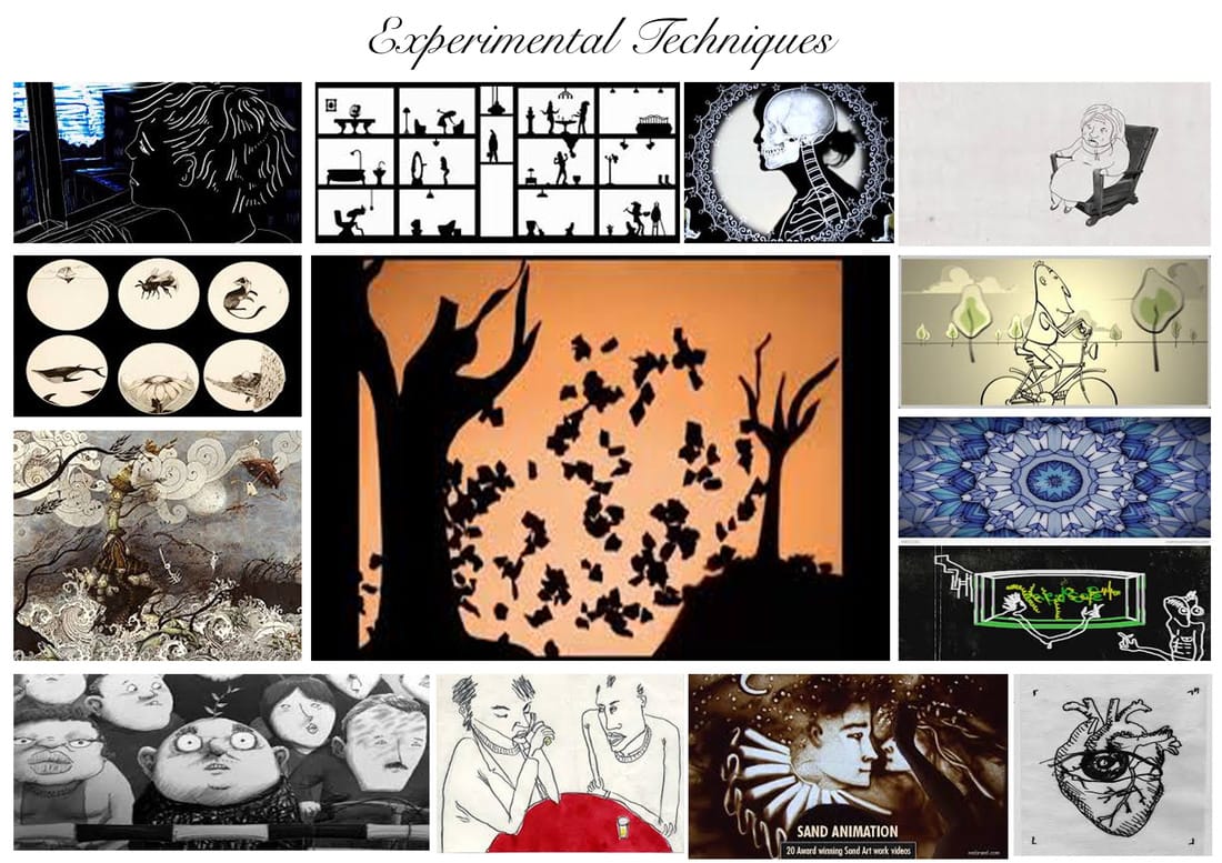
Experimental Technique Moodboard:
For the experimental techniques within my Documentary, I want to use rotoscoping, under the camera and silhouette cut-outs for the government characters. The experimental techniques will revolve around dark and gothic colours because these will be used for the 'harsher' moments in my Nan's life.
There will be some elements of experimental animation that will be used to explain memories and how Joey behaves in day-to-day life; these will be similar to the hand drawn animation seen on the mood board below.
There will be some elements of experimental animation that will be used to explain memories and how Joey behaves in day-to-day life; these will be similar to the hand drawn animation seen on the mood board below.
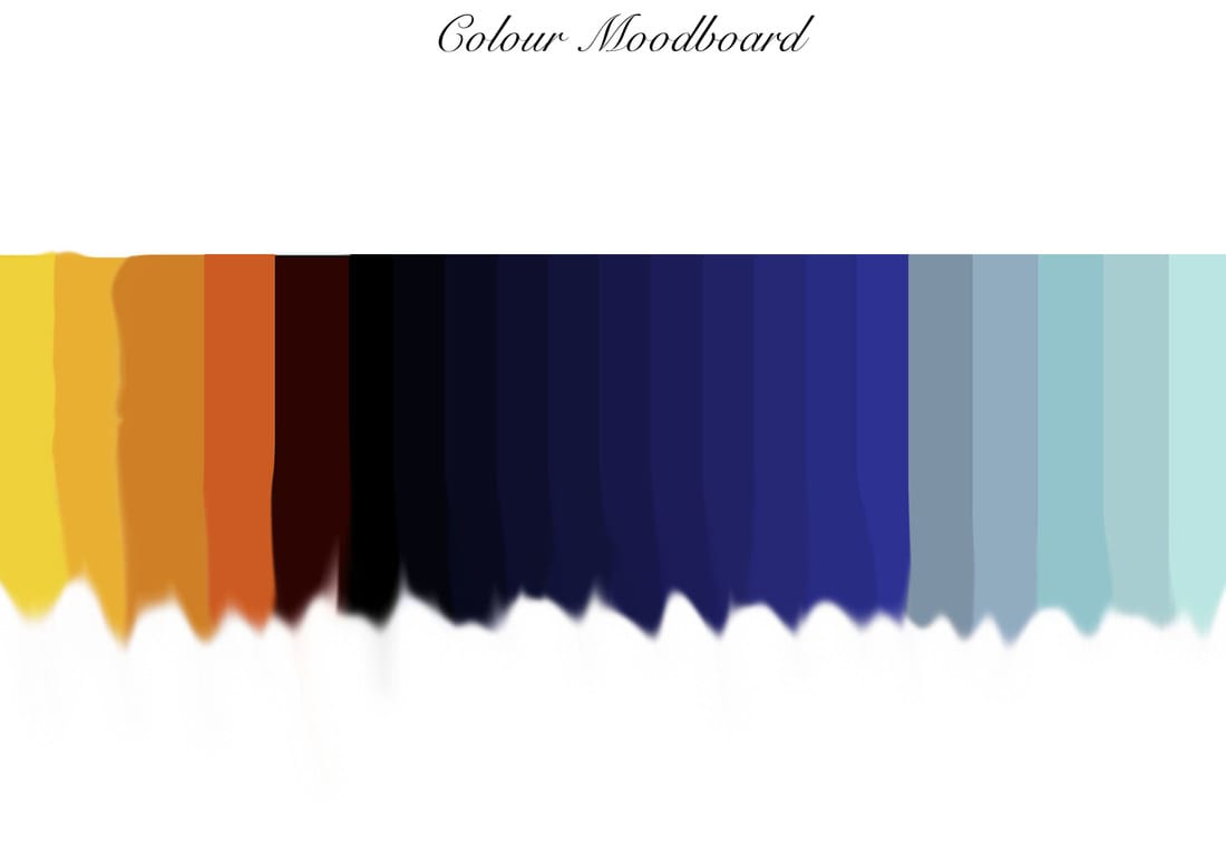
Colour Theory Moodboard:
So I could identify what colours would be used for my Documentary, I decided to essentially create a 'colour moodboard' palette that I could refer back to when I begin production.
(from left to right)
The first 4 colours are harmonious colours and will be used in a sepia tone to display aspects of my Nan and Grandad's life, this is a stylistic element I've chosen due to the auteur nature of my film. Mainly because when I remember my Nan and Grandad in my own head, I always picture them being in a sepia coloured life, a reason why I think this is because I didn't get to see them in person when they were younger. Therefore, I always imagined them in a different colour.
The next 11 colours will be used for the government characters who will be mainly in silhouette and washed out blues to portray the 'cold' nature of their letters to my Nan and Grandad about Joey's conditions. Considering the respite centre my uncle attends is now being closed down, I want to be able to show how callous this decision is and also how much it can effect a family such as my Nan's.
The remaining 6 colours will be used for ideologies of hope, this is because although the situation that my uncle and Nan are in is heart-wrenching, my Nan always remains positive. I want this to be a constant theme, that in the face of adversity they always pull through - just like so many other carers and people with mental health problems/learning disabilities do.