Colour Theory within Storyboards:
Colour is measured in wavelengths to allow our eyes to pick up the in between of 'Infra Red' and 'Ultra Violet', although your eyes cannot specifically measure this. This is measured through the cone cells within your eyes, for example when a red light is shone into your eyes , the cone cells work to identify this colour as red which is then associated with the 'red cone'. You can also have 'blue cones' and 'green cones'.
This is why we use cameras to pick up the colours that the naked eye cannot see, as biologically we have been evolving that was to see our natural environment to survive. Whilst colour principles remain consistent, colour does work differently in different environments. This is because of the way our eyes function;
They pick up three colours: Yellow, Magenta and Cyan. These allow colours to be mixed to produce a greater array of the colours we see within today.
Understanding Colour within Film and Animation:
To understand 'The Science behind Colour' you have to look at Newton's prism to grasp that light isn't a mixture of light and darkness, that in-fact light is responsible for colour.
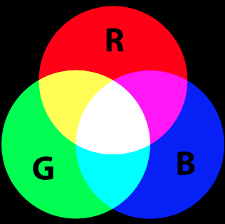
There are two effects involved within colour; additive and subtractive. This then moves over to colours such as red, green and blue also known as complimentary colours; meaning that a colour can be assigned to a numerical value to the colour emitted by the light source. This is referred to as a 'Kelvin Scale'.
Colour Palette:
Colour aesthetics can be approached from three directions:
The visual character of a colour palette allows the quality of the film to attract an audience, some films can be grainy, de-saturated, others are slick, saturated or monochromatic while others have a brown dusty palette. Within a colour palette, there will be a cinematographer who is used to interpret the screenplay in a visual form and guide the viewers emotions through colour, light, composition and movement. It is important that both the director and cinematographer understand the thematic elements of the story and how to enhance it through colour and light.
Additionally, the colour palette begins a direct, visual interpretation of the script that makes it a reality on screen, where it then takes on a subtle character of it's own. The colour palette is then allowing the audience to attache themselves to a mood or feeling that then stays with them even when the film is over.
Elements of the Colour Palette:
To understand 'The Science behind Colour' you have to look at Newton's prism to grasp that light isn't a mixture of light and darkness, that in-fact light is responsible for colour.
There are two effects involved within colour; additive and subtractive. This then moves over to colours such as red, green and blue also known as complimentary colours; meaning that a colour can be assigned to a numerical value to the colour emitted by the light source. This is referred to as a 'Kelvin Scale'.
Colour Palette:
Colour aesthetics can be approached from three directions:
- Impression (visually)
- Expression (emotionally)
- Construction (symbolically)
The visual character of a colour palette allows the quality of the film to attract an audience, some films can be grainy, de-saturated, others are slick, saturated or monochromatic while others have a brown dusty palette. Within a colour palette, there will be a cinematographer who is used to interpret the screenplay in a visual form and guide the viewers emotions through colour, light, composition and movement. It is important that both the director and cinematographer understand the thematic elements of the story and how to enhance it through colour and light.
Additionally, the colour palette begins a direct, visual interpretation of the script that makes it a reality on screen, where it then takes on a subtle character of it's own. The colour palette is then allowing the audience to attache themselves to a mood or feeling that then stays with them even when the film is over.
Elements of the Colour Palette:
- Film Stock
- Filters
- Gels
- Hand Drawn Techniques
- Daylight Balancing
- Colour Temperature
- Exposure to achieve a specific look
Mise-en-scene
Mise-En-Scene is everything that is 'put in the scene', it was originally used to describe a theatre set. To remember this there is CLAMPS; Character/Costume, Lighting, Acting, Make-up, Props and Settings/Shot Composition. Additionally, this follows on to the production designer who is then responsible for the visual aspects such as Line,Shape, Texture, Ornament and Colour.
The good use of Mise-en-scene can compensate for nearly the impossible, it can create the films style and show what the audience need to see whilst allowing them to understand what is happening. It can also serve to understand the visual subtext of the film an allow you to see the production from the directors eye.
Scanned Images for Storyboarding and Animatic:
I decided to find old photographs to film under the camera for the opening sequence of the animatic and the documentary. I wanted to be able to test them to make sure they had the correct look I wanted. I think they worked really well for use under the camera as it gave the documentary a 'vintage' feel, which is what I set out to achieve from the proposal.
I decided to find old photographs to film under the camera for the opening sequence of the animatic and the documentary. I wanted to be able to test them to make sure they had the correct look I wanted. I think they worked really well for use under the camera as it gave the documentary a 'vintage' feel, which is what I set out to achieve from the proposal.
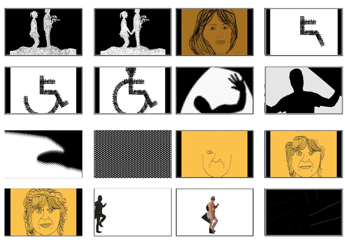
Storyboard:
For my storyboard, I wanted to make sure I was using harmonious colours for the voiceovers that are my nan, grandad and mom; this is because I want to connote to the audience that these characters are warm, whereas the government characters or politicians will be contrasting colours or 'cold' colours and this is a stylistic element I've chosen as there has been a lack of control on autism, epilepsy and learning difficulties from the perspective of the officials.
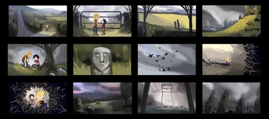
I began to storyboard using hand-drawn methods and came across a lot of problems in regards to making sure I was making my point effectively to showcase the experimental techniques I would be using. This didn't work particularly well and I then decided to move over to working digitally so I could attempt to put the sound alongside the visuals in a more refined and structured manner.
For my storyboard, I wanted to make sure I was using harmonious colours for the voiceovers that are my nan, grandad and mom; this is because I want to connote to the audience that these characters are warm, whereas the government characters or politicians will be contrasting colours or 'cold' colours and this is a stylistic element I've chosen as there has been a lack of control on autism, epilepsy and learning difficulties from the perspective of the officials.
I began to storyboard using hand-drawn methods and came across a lot of problems in regards to making sure I was making my point effectively to showcase the experimental techniques I would be using. This didn't work particularly well and I then decided to move over to working digitally so I could attempt to put the sound alongside the visuals in a more refined and structured manner.
Storyboard Version 2 - Final
For the digital version of my storyboard, I expanded the original and managed to delve further into the techniques I wanted to use. By using Photoshop and After Effects I was able to capture exactly what I want to produce for my documentary whilst also being able to show the techniques I will be using.
First Board:
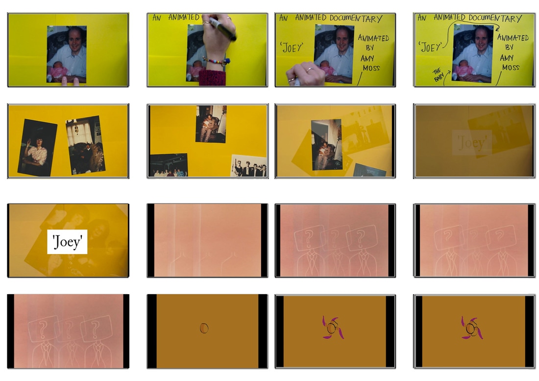
The first four frames are referring to the intial introduction to 'Joey', I wanted to be able to encompass his personality, alongside the voiceover which is reinforcing what is being shown. The images represent my own relationship with 'Joey' from a baby. This then transfers onto the old photographs of my Nan and Grandad with Joey in them too. Although I used the frames from a test I completed within the first few weeks of this module, I was able to use them to showcase what I want as an introduction to Joey's conditions.
This then transfers onto the 'heads' as the government, these were a test under the camera I am able to connote that when the letters are being sent out to my Nan about Joey's conditions (from the government) that they are usually just a program sending out a routine letter.
Second Board:
The emphasis of the flower for my nan represents her kind-hearted nature and also her innocence with the way she's been treated from being a carer for Joey. I wanted this part of the documentary to be quite linear; just to show the audience the life of my Nan before she had Joey. Then from the bottom few images it will slowly transition into her meeting my Grandad and their life with 'Joey' beginning together.
The emphasis of the flower for my nan represents her kind-hearted nature and also her innocence with the way she's been treated from being a carer for Joey. I wanted this part of the documentary to be quite linear; just to show the audience the life of my Nan before she had Joey. Then from the bottom few images it will slowly transition into her meeting my Grandad and their life with 'Joey' beginning together.
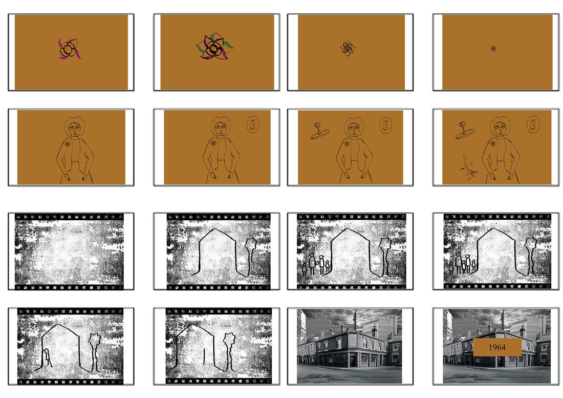
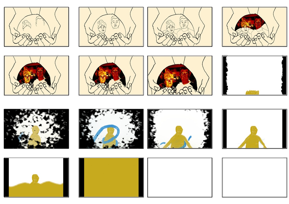
Third Board:
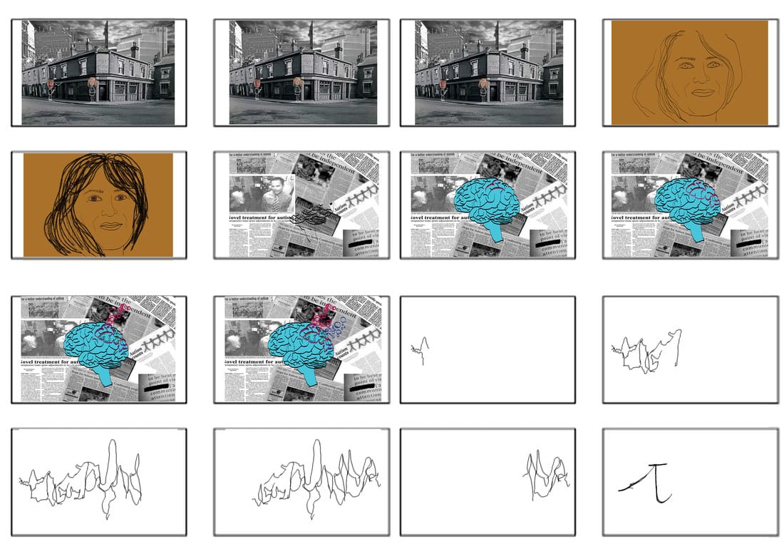
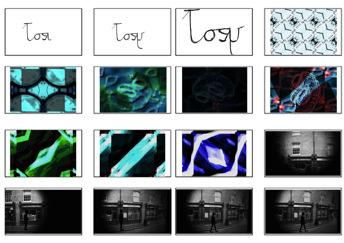
This part of the documentary is when it starts to become very experimental, for the use of the heads; I want them to be rotoscoped to add a sense of realism. This will allow the audience to break down the information and be able to gain another perspective into the life of my Nan.
The newspaper cuttings are articles surrounding autism and mental health issues, ranging from when Joey was born until the present day. This is a stylistic element I have chosen to further emphasise how real the issues surrounding disability and mental health are. Although, it's being shown via animation it doesn't mean that it's not real-life and should be treated as very important and heart-wrenching issue.
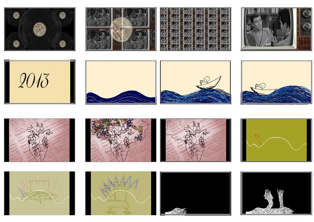
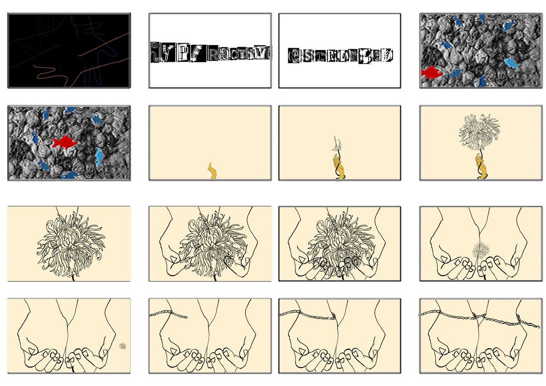
The meaning of the Chrysanthemum:
Within my documentary, I wanted to implement a symbol that could be decoded by the audience if they further thought about it. Towards the end of the storyboard (board 7) - "As November’s official flower of the month, the Chrysanthemum brings us the message that even the beginning of winter can have joy and beauty. It’s also the traditional flower of choice for Mother’s Day gifts in Australia. The Victorians considered it strictly a flower of friendship and well-wishing for people in need of rest, so deep red Chrysanthemum of passion were rarely passed around in that society. The Chrysanthemum is also the flower representing the royal family of the Emperor in Japan. Floral specialists in the U.S. generally consider that the Chrysanthemum means cheerfulness and positivity, but in New Orleans it is only used for All Saints Day celebrations and has become a symbol of the honored dead in that city. It’s called one of the Four Gentlemen in Chinese culture, which reflects the flower’s importance as a symbol in artwork." (1)
Also represents:
My nan was born on November 12th 1939, so her birth flower is a chrysanthemum and considering this flower is also referred to as the 'mum' flower I think it seems appropriate that it's used to present my Nan in an experimental manner. She is as bright and vibrant as a chrysanthemum, and when I begin to produce this documentary I hope to be able to use a real flower under the camera alongside the technique of pixilation.
Also represents:
- Lasting friendship and non-romantic affection
- Support from your family and loved ones
- Cheerfulness and good spirits, including cheering up a sad person
- Rest and recovery after a long trial or challenge
- Enduring life and rebirth, especially the birth of a child
- Loyalty and devotion, both romantic and platonic
My nan was born on November 12th 1939, so her birth flower is a chrysanthemum and considering this flower is also referred to as the 'mum' flower I think it seems appropriate that it's used to present my Nan in an experimental manner. She is as bright and vibrant as a chrysanthemum, and when I begin to produce this documentary I hope to be able to use a real flower under the camera alongside the technique of pixilation.
Reference:
1.) http://www.flowermeaning.com/chrysanthemum-flower-meaning/
1.) http://www.flowermeaning.com/chrysanthemum-flower-meaning/
